£230
Tree Donation
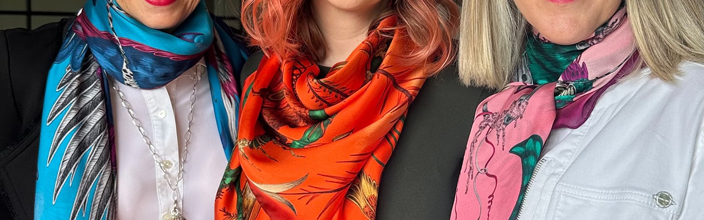
You're shopping in
Select your preferred currency
Colour Theory
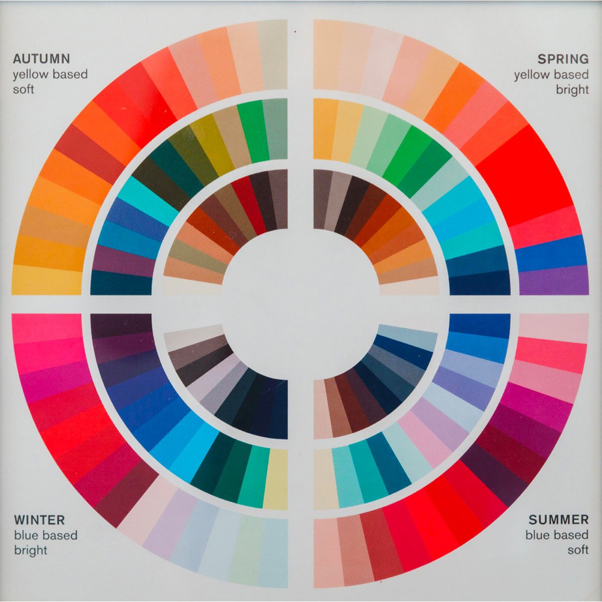
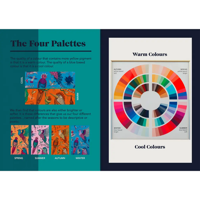
The colour theory Red Leopard work with was developed in the 1920’s at the Bauhaus school of Art, Architecture and Design. Many famous artists worked there as teachers, and the head of the Painting School was Johannes Itten, who started to do research on colours and the differences between them.
Primary Colours
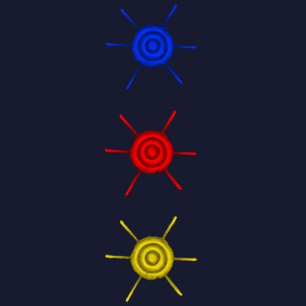
The first thing that they discovered, was that there were three primary colours: yellow, red and blue, and that from these three colours you can make any other colour you want (with the addition of black and white).
Secondary & Tertiary Colours
They also found that adding either more blue pigment or more yellow pigment will affect the way a colour looks.
For example if you mix yellow and blue together you make green – but depending on how much yellow or blue you put into the mixture, you end up with a different type of green.
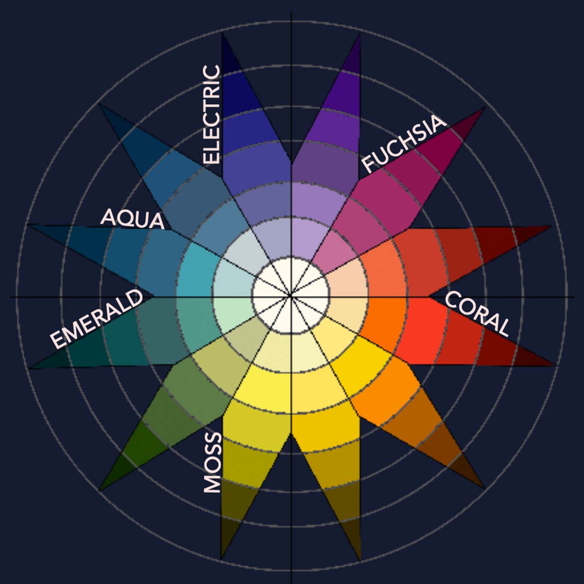
More yellow – you get a yellower, Kerry green or even a mossy green…more blue, and you get a bluer, emerald green.
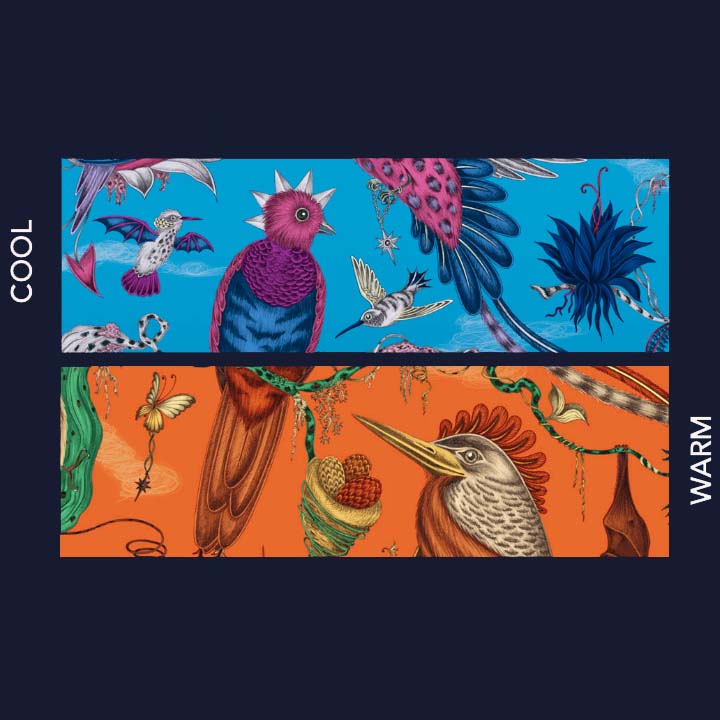
This is true of all colours – pinks (yellower pinks are coral or geranium, and bluer pinks are shocking or fuchsia), blues (yellower blues are aqua or peacock, bluer blues are cornflower or electric). True red is a neutral. Add yellow and you get an orangey red, add blue and you end up with a deeper carmine.
The quality of a colour that contains more yellow pigment is that it is a warm colour. The quality of a blue based colour is that it is a cool colour.
We then find that colours are also either brighter or softer. It is these differences that give us our four different palettes…named after the seasons to be descriptive or poetic:
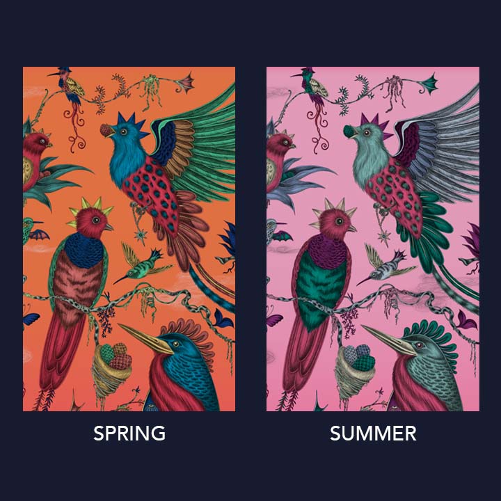
SPRING
Warm yellow based and bright colours – think of geraniums, poppies, newly mown lawns, citrus fruits, apricots, cream, turquoise seas
SUMMER
Cool blue based soft colours – think of an English country garden, sweet peas, cornflowers, anenomes, candyfloss, hyacinths, lilac
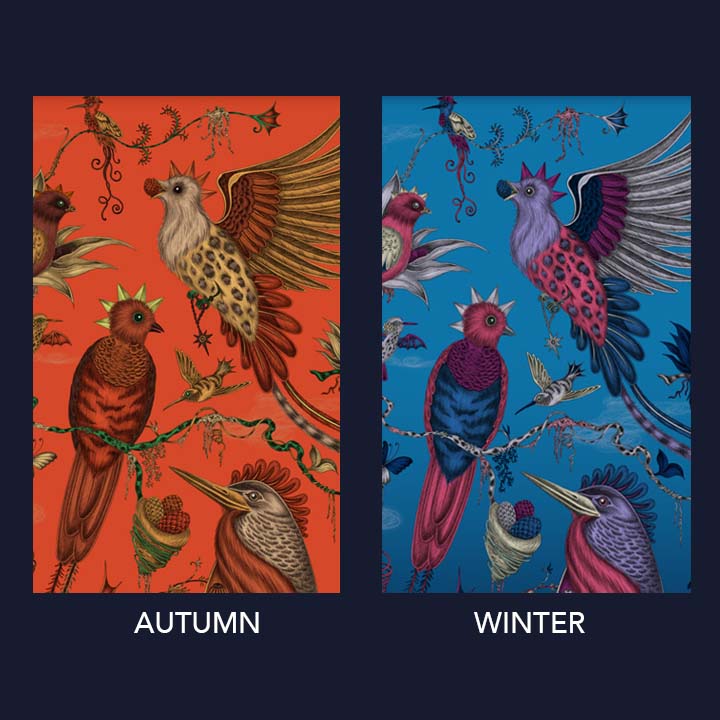
AUTUMN
Warm, rich, earthy colours – autumn leaves, chestnuts, bonfires, moss, lichen, bronze, heather
WINTER
Cool blue based bright colours – think of snow, ice, granite, rock, pine trees, berries and jewel colours.
Red Leopard offer personal colour consultations to discover your best palette, which can be done in person or over Zoom. Please get in touch with them via their website if you would like to book a consultation or find out more.
£230
Tree Donation
£0
£230
Best Seller

£230
As seen in The Gentlemen